UNDERSTANDING ASPECT RATIOS
One of the first and primary considerations when creating, editing and mastering a project is its aspect ratio. It defines the shape of the frame. Calculating out the required resolutions for particular aspect ratios can be a little tricky so we’ve created a cheat sheet to help simplify this process:
Aspect Ratios
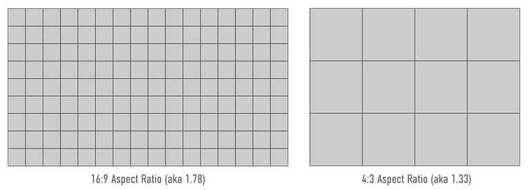
An aspect ratio is a value given to describe picture width compared to its height. In essence it describes the shape of the rectangle that makes up a picture frame. For example the most commonly available TV today has a screen aspect ratio of 16:9. This ratio is a description that if you were to divide the image horizontally by 16 equal units, there would also be 9 of those units vertically. In earlier years of standard definition television, the prevailing standard was 4:3. You can see the difference in the image below.
One alternative way of referencing aspect ratios is using a single numerical value with a decimal point. For example 16:9 can also be called 1.78 – that’s because 1.78:1 is the same ratio as 16:9 but rather than keeping the ratio as whole numbers, it uses a decimal point to accurately specify the aspect ratio as a single number. You can calculate this quite easily for yourself as 16/9 = 1.78.
There has been a huge variation of aspect ratios used in film, TV and still photography over history. Aspect ratios can be a combination of technical and creative choice depending on the project at hand. As you can imagine, the chosen aspect ratio greatly affects how to compose shots and consequently artists will need to be thinking about their intended display method when selecting the shooting aspect ratio for a project.
For example a stills photographer will often be printing their work at a 3:2 aspect ratio and so need to frame accordingly. Conversely someone targeting an Instagram feed or social media feed may prefer to aim for a square 1:1 aspect ratio. On the feature film side of things a director of photography may choose to aim for either a “Scope” aspect ratio (2.35) or a “Flat” aspect ratio (1.85). So what do we do when we’re using a device (phone, tv, cinema screen) that has a fixed display aspect ratio but all of our content arrives in differing aspect ratios? Letterboxing, Pillarboxing or cropping.
Letterboxing
Letterboxing is used when the aspect ratio of the content is wider than the aspect ratio of the device playing back the content. It results in black bars going on the top and bottom of the content to pad it out to the required aspect ratio. It’s given the name because the bars above and below the image create an opening that resemble a slot letters could go into like a letterbox.

Pillarboxing
Pillarboxing occurs when the aspect ratio of the content is narrower than the device playing back the content. It results in bars going down the left and right hand side of the image to pad it out to the correct aspect ratio. It’s named "pillarboxing" because the two vertical black bars on the left and right resemble pillars.

Cropping
Cropping is the other option which zooms in on an image until it fills an entire frame even if it began in a different aspect ratio. This results in a losing some of the visual content as it is then pushed outside of the frame.

2.40 Aspect Ratio content
Cropped into a 16:9 (1.78) Frame